10 WordPress Web Design Trends That Will Inspire You
[Source: Pixabay]
There’s no way around it: people do “judge a book by its covers.” This is why your website needs to be designed to appeal to your target audience, spark their interest, and keep them engaged in your content for longer periods of time.
If you plan to redesign your website or build one from scratch but lack inspiration, you came to the right place.
This article will present you with 10 up-to-date WordPress web design trends that will ignite your imagination and help you unblock your creative mind.
1. Nostalgia themes
2. Micro-interactions
3. Memphis design
4. Dark theme
5. Fluorescent 3D details
6. Gradients
7. Bold fonts
8. Geometric shapes
9. Parallax scrolling
10. Neo-brutalism
Let’s begin!
1. Nostalgia themes
[Source: onextrapixel]
Why use nostalgic themes? Well, nostalgic themes can connect with your audience on a more emotional level, and as every marketer knows, emotions sell.
There is a new web design trend that takes us back to the 1990s, the era when technology started to gain some real traction. This retro design style is mostly based on using imagery from old video game consoles that bring out our childhood memories.
But there are other past-specific visual elements from other eras that can make your website emit vintage vibes, including:
- Vintage Photography – black and white photographs can convey a more sentimental value than modern-age, high-quality, rigid images.
- Graffiti – using rough and edgy graffiti fonts can take your audience straight to the 90s, when this street art gained mainstream relevancy for the first time.
- Pop art – dating back to the 50s, pop art design can be very appealing to your older audience, such as Gen Z and boomer generations.
If you choose a nostalgic theme for your web design, use positive references from the past and blend them in with contemporary design solutions so that you don’t lose your website’s functionality and accessibility.
2. Micro-interactions
Micro-interactions are website elements that come alive when your visitors hover, scroll, or click on them.
The most popular choices for micro-interaction solutions are:
- Sign-up forms
- Share buttons
- Call-to-action (CTA) buttons
- Tap and hold elements
- Horizontal scroll buttons
- Text or image reveal upon clicking or hovering
These user-initiated interactions can be a perfect addition to your website, but you have to design them with intention, meaning they should have a purpose behind them.
3. Memphis design
[Source: 99designs]
Memphis design refers to applying bright, pop-up colors to contrast a black or white background and is another “blast from the past,” dating back to the jovial 80s. Besides the distinctive color schemes, this design approach also uses abstract shapes, patterns, and images.
It is a great, bold choice for creating an eye-catching website that attracts instant attention. To achieve this retro look, you can use the Sesame Street color scheme, odd-shaped, multi-colored objects, large bold fonts, and many more.
You should only be careful not to overdo it, as it can result in a tacky, tasteless design.
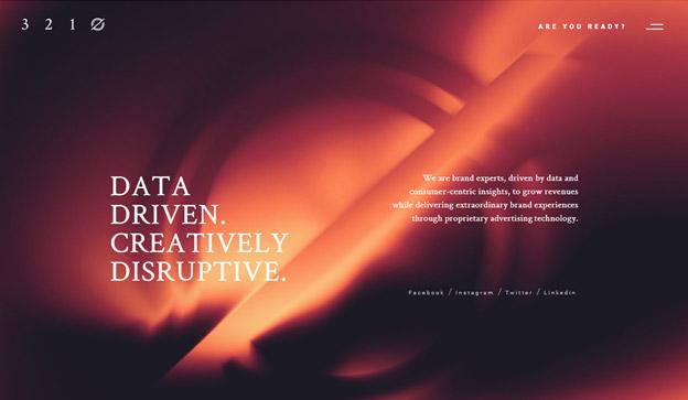
4. Dark theme
[Source: Unified Infotech]
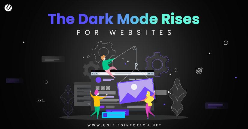
Dark mode themes are great for emphasizing your visual content and guiding the audience toward the important elements of your website.
This modern approach is great for providing your users with a more relaxing browsing experience, as it produces less strain on their eyes and offers great visibility in low-light settings.
Dark themes can give a website a bit more of a serious note, so it could be one of the suitable choices for corporate web design.
If you choose a dark theme for your website, make sure you don’t go too dark, apply proper contrast, and don’t forget to desaturate your colors.
5. Fluorescent 3D details
[Source: cyberchimps]
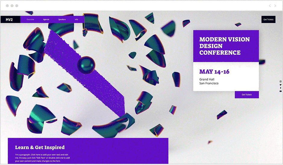
Fluorescent 3D digital elements offer a shortcut to catching your visitors’ attention. They work best on websites when they are placed against a clean, minimal background.
If you choose to implement these eye-catching elements into your web design, you should ensure that the fluorescent colors are in a secondary place in your color palette.
6. Gradients
[Source: Zillion Designs]
A gradient refers to a gradual transition from one color to another. This effect gives the objects more depth, making them appear in a 3D shape.
Here are some general rules you should follow when using gradient design for your website:
- Avoid a grayish middle by adding a third color to your gradients.
- Use colors that contrast each other.
- Be aware of your light source.
- Be cautious of banding lines within your color gradients.
Gradients can help your important website elements, such as icons, buttons, headers, etc., appear more vibrant and appealing.
7. Bold fonts
[Source: iStock]
When used in the right place and in the right quantity, bold typography is great for emphasizing important messages on your site and demonstrating the visual hierarchy.
Balded text is easier to read and instantly noticeable, and you should only use it to guide your visitors’ attention toward the main elements on your web page, such as the company’s logo, headlines, or jump lines.
8. Geometric shapes
[Source: Hongkiat]
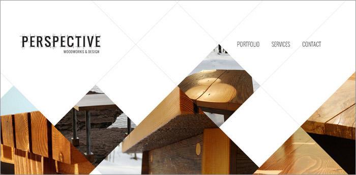
Different geometrical shapes convey different emotions. For instance:
- Squares and rectangles represent stability, honesty, and rationality.
- Circles are linked with infinity, harmony, and perfection.
- Triangles are associated with action and aggression.
- Hexagons communicate unity and strength.
When using geometrical shapes in your web design, go for a minimalistic approach and choose a group of shapes that will communicate the right emotions to your target audience.
9. Parallax scrolling
The parallax scrolling effect is used for creating faux 3D effects so that when the user scrolls down a web page, layers of content move at a different speed, thus creating an alluring optical illusion.
Implementing this effect in your web design can be a great tool for improving user engagement and streamlined storytelling.
10. Neo-brutalism
[Source: brutalistwebsites]
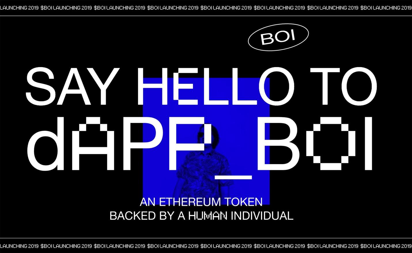
One of the most recent trends in web design, neo-brutalism, aims to break the rules of clean and reliable patterns in web design.
This daring approach is not everybody’s “cup of tea,” so it’s best used for designing art-related websites.
Conclusion
When you are choosing what trends to implement in your web design, always keep your target audience in mind.
If your visitors are mostly members of older generations, go for a nostalgic, retro approach. If you aim to attract a younger audience, consider creating a more vibrant, playful look.
We hope our article managed to spark your creative flame and make your next web design task a walk in the park.
 Previous Post

